GRAPHIC DESIGN
SIBIL OF THE RHINE (BRANDING, PRINT DESIGN, AND SOCIAL MEDIA)

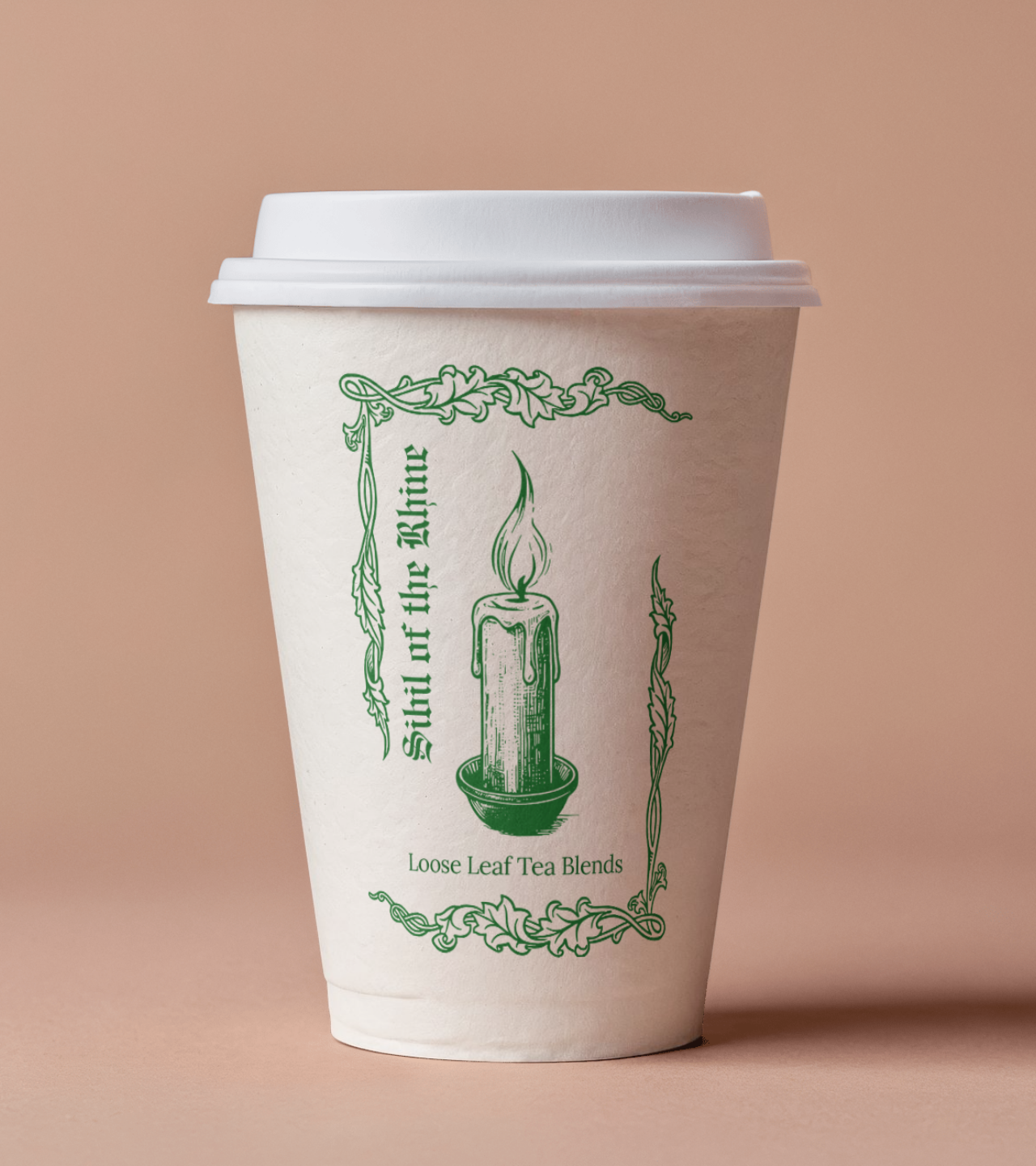
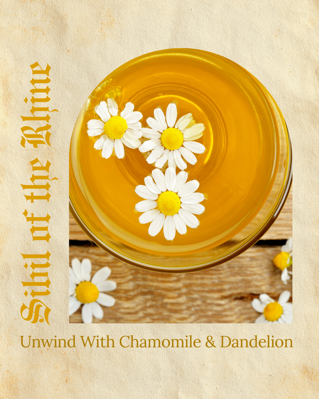
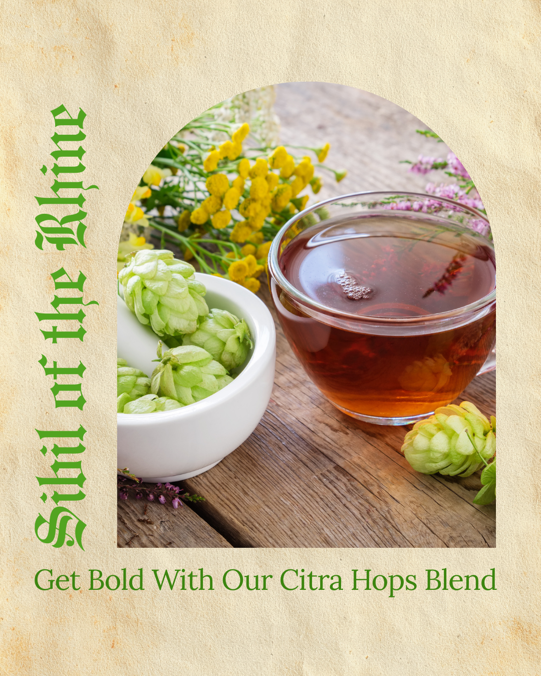
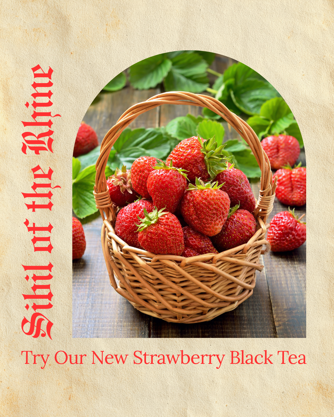
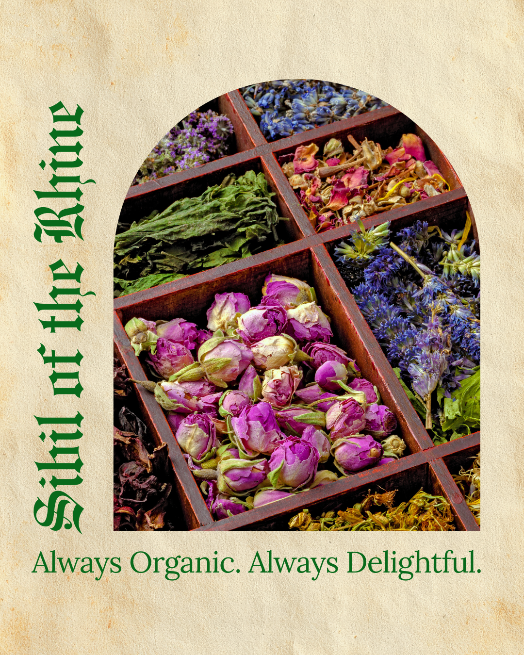
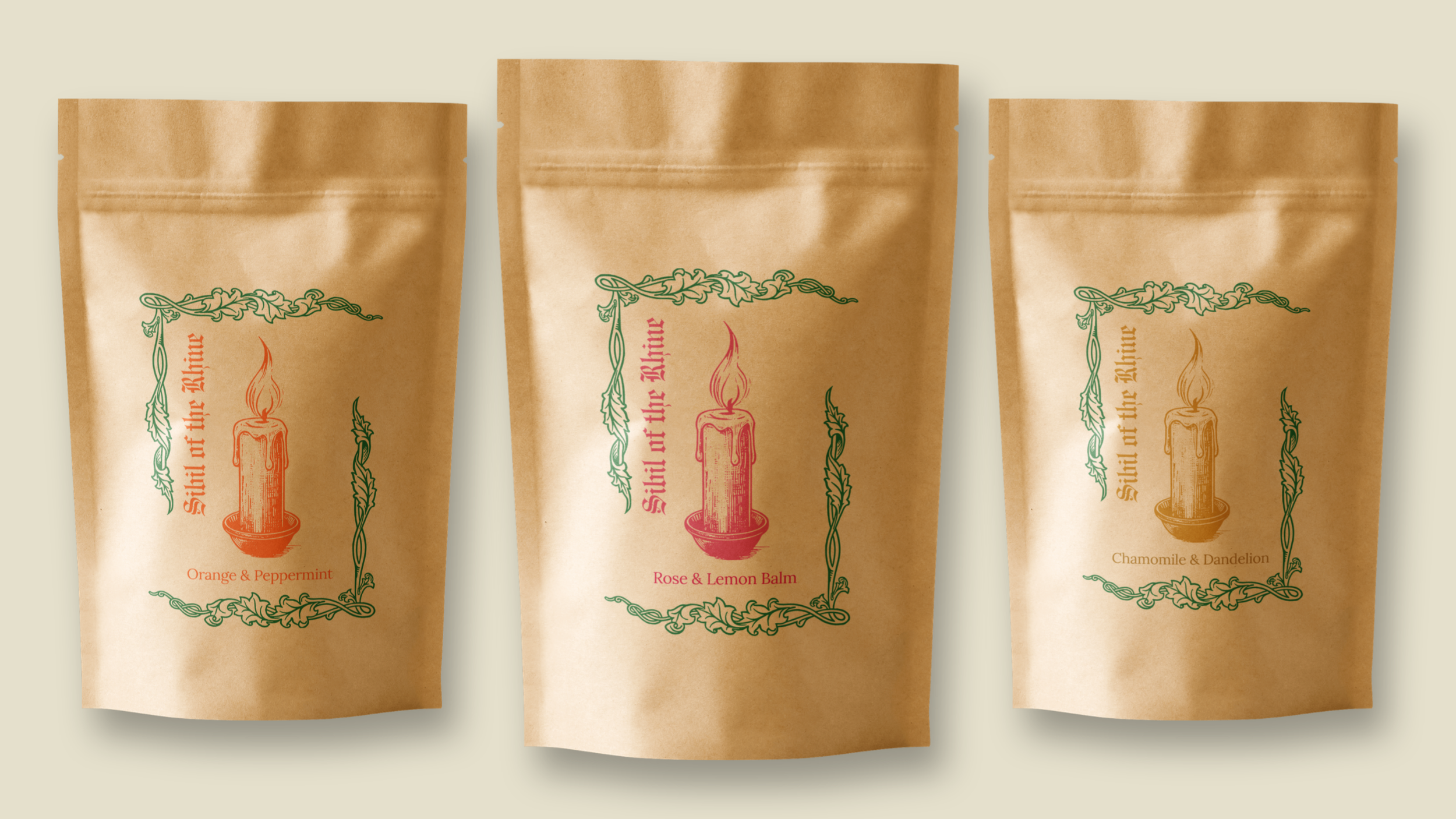

Objectives: Develop branding for a tea company that can be used across various print products and social media. The design also needed to evoke a sense of coziness while drawing inspiration from medieval manuscripts.
Process/Solution: I started by researching the company's namesake. St. Hildegard’s symbols often include flames, light, feathers, and a staff. Since this is for a tea company, I chose a candle image to emphasize the warmth and comfort of tea. For the border, I knew I wanted something similar to an illuminated manuscript, but also something that could balance out the composition and provide a stronger reference to medieval imagery. I paired a blackletter with a modern serif font to match the aesthetic without sacrificing readability for the individual tea blends.
Tools: Photoshop, Adobe Stock, Premiere Pro, and public domain archives.
KINDLING ARTS VALENTINES (POSTCARDS FOR PRINT AND SOCIAL MEDIA POSTS)
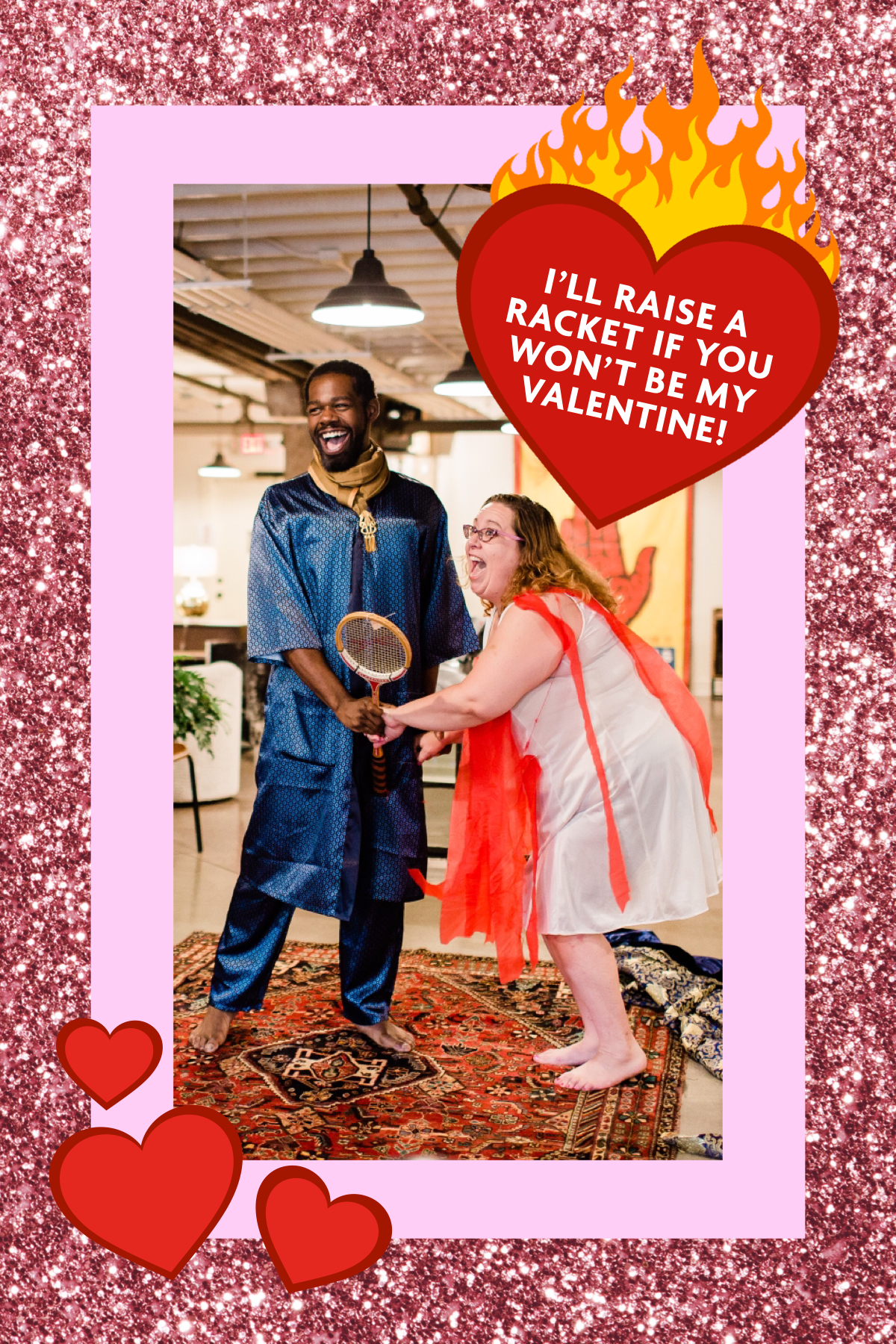
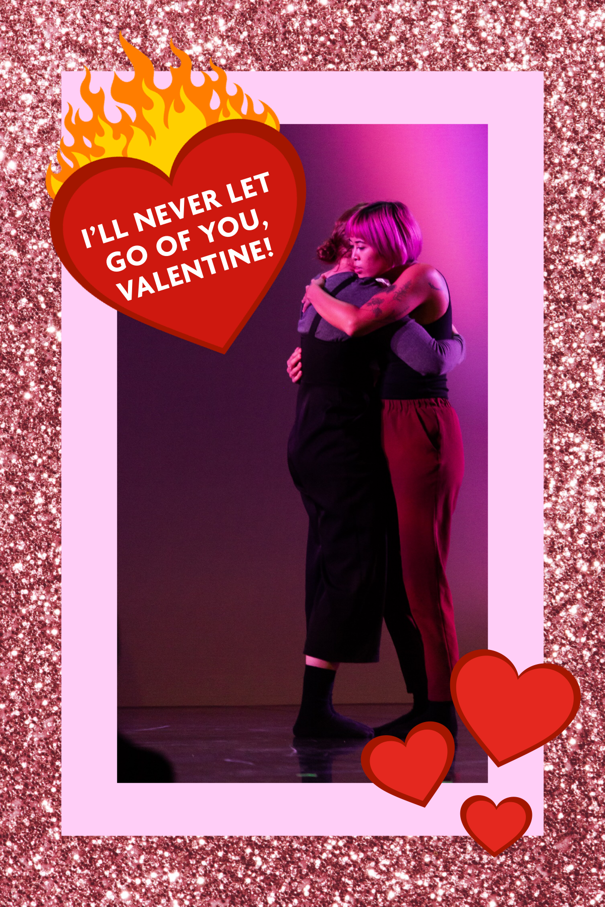
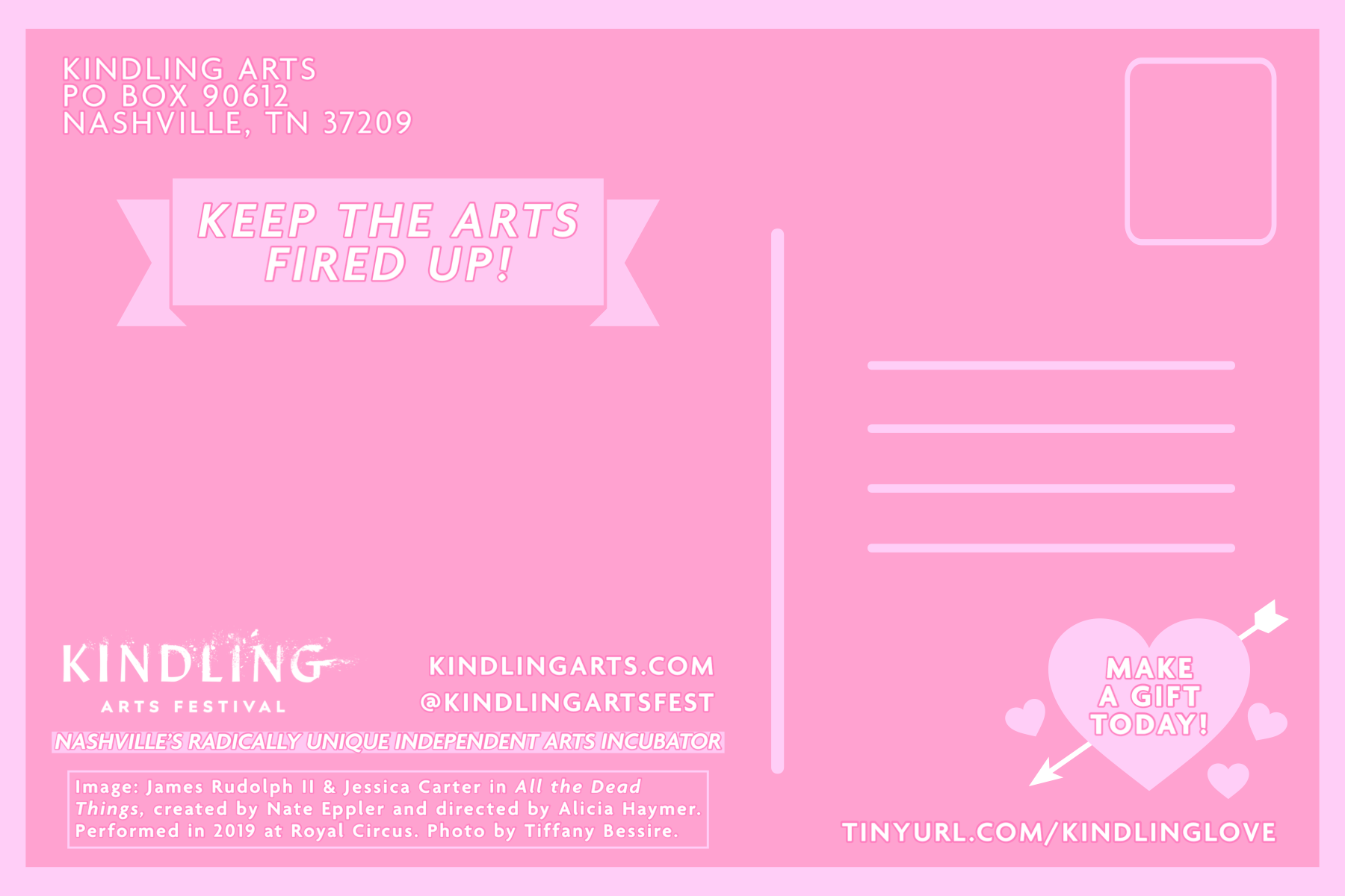
Objectives: Create cheesy, 1990s-inspired Valentines to send to sponsors.
Process/Solution: Photos and text were provided by the festival directors. I created the hearts, flames, and elements for the back of the postcards in Photoshop. The glitter border was created in Procreate. From there, I brought everything into InDesign to create the print-ready postcards. The GIFs were created in Photoshop and Procreate. The GIFs with animated glittery hearts were an idea I pitched to the festival directors that we quickly ran with. It not only gave the project an added flourish of kitsch but also allowed Kindling to share the front side of the Valentines across digital platforms to all fans of the festival while still keeping the printed version exclusive to the sponsors.
Tools: Photoshop, Procreate, and InDesign.
DIY SHARE FAIRE (BRAND DEVELOPMENT AND SOCIAL MEDIA POSTS)
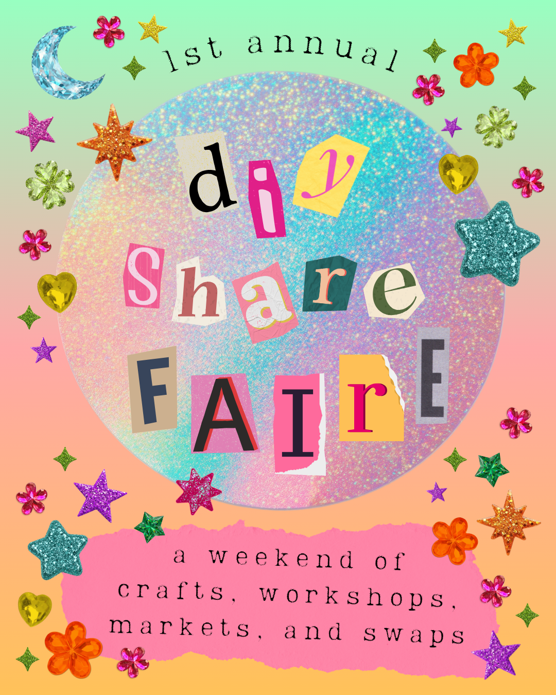
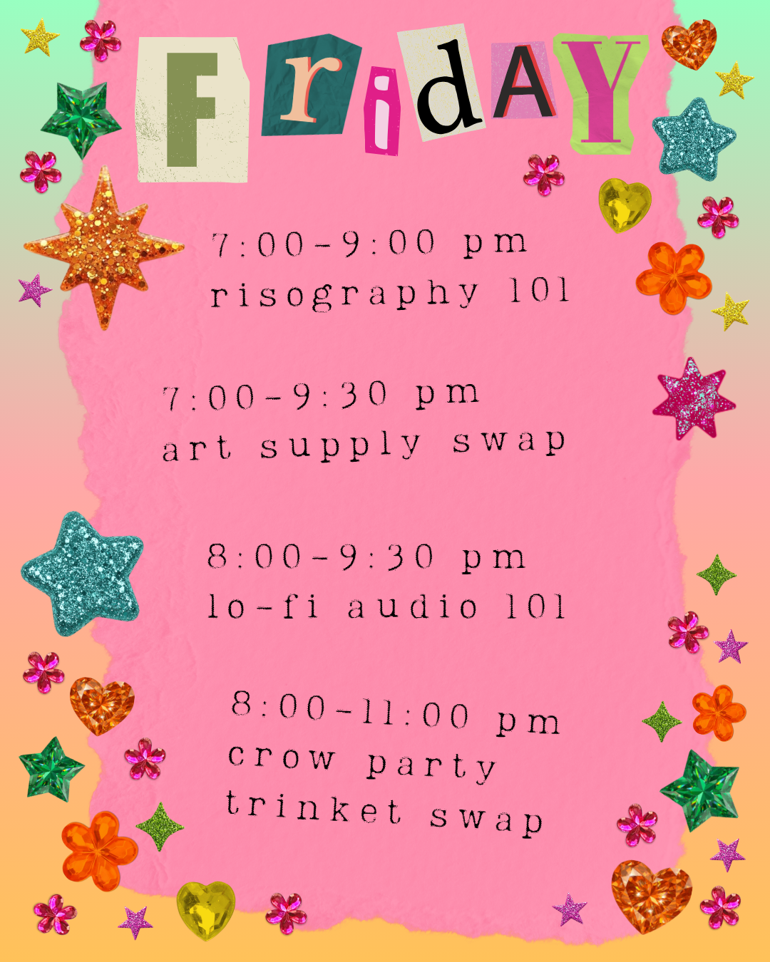
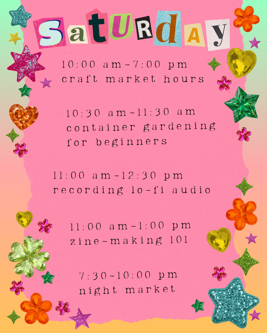
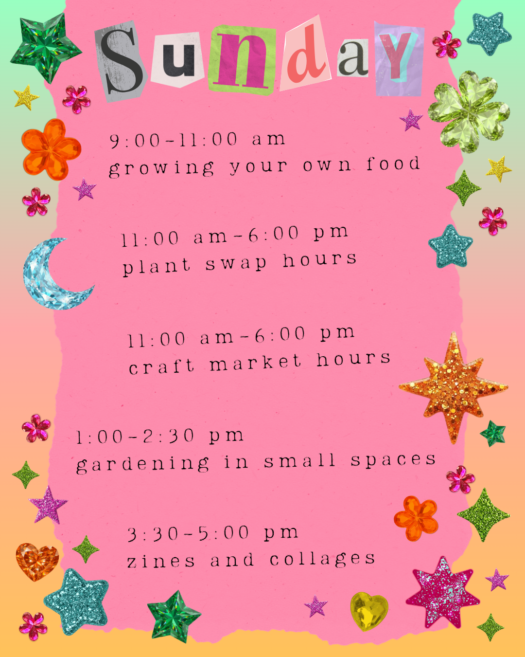
Objectives: Develop branding and social media posts that showcase the festival’s DIY mentality. The festival’s main focus is to foster a safe space for artists to learn, share, and step outside their creative comfort zones.
Process/Solution: I drew heavily on one of my own collage styles, using torn paper, vibrant colors, and rhinestones. Other ways I represented the festival's DIY ideals and fearless creativity included using magazine letters and crookedly placing elements. It’s an aesthetic that says, “let loose, get messy, and have fun with some glitter glue.” As creatives, we need to take time to be silly, to give in to whimsy, and make something purely for ourselves.
Tools: Photoshop, Adobe Stock, Lightroom, and Premiere Pro.
ICONIC WOMEN OF HORROR (BOOK COVERS)
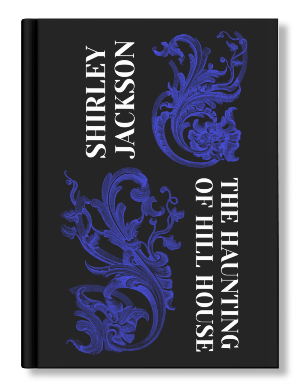
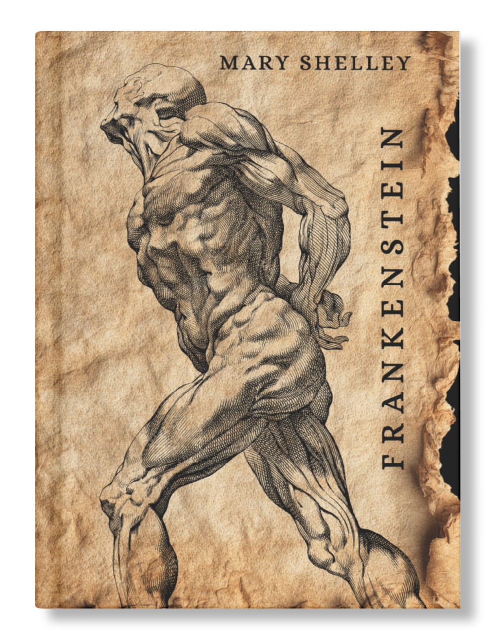
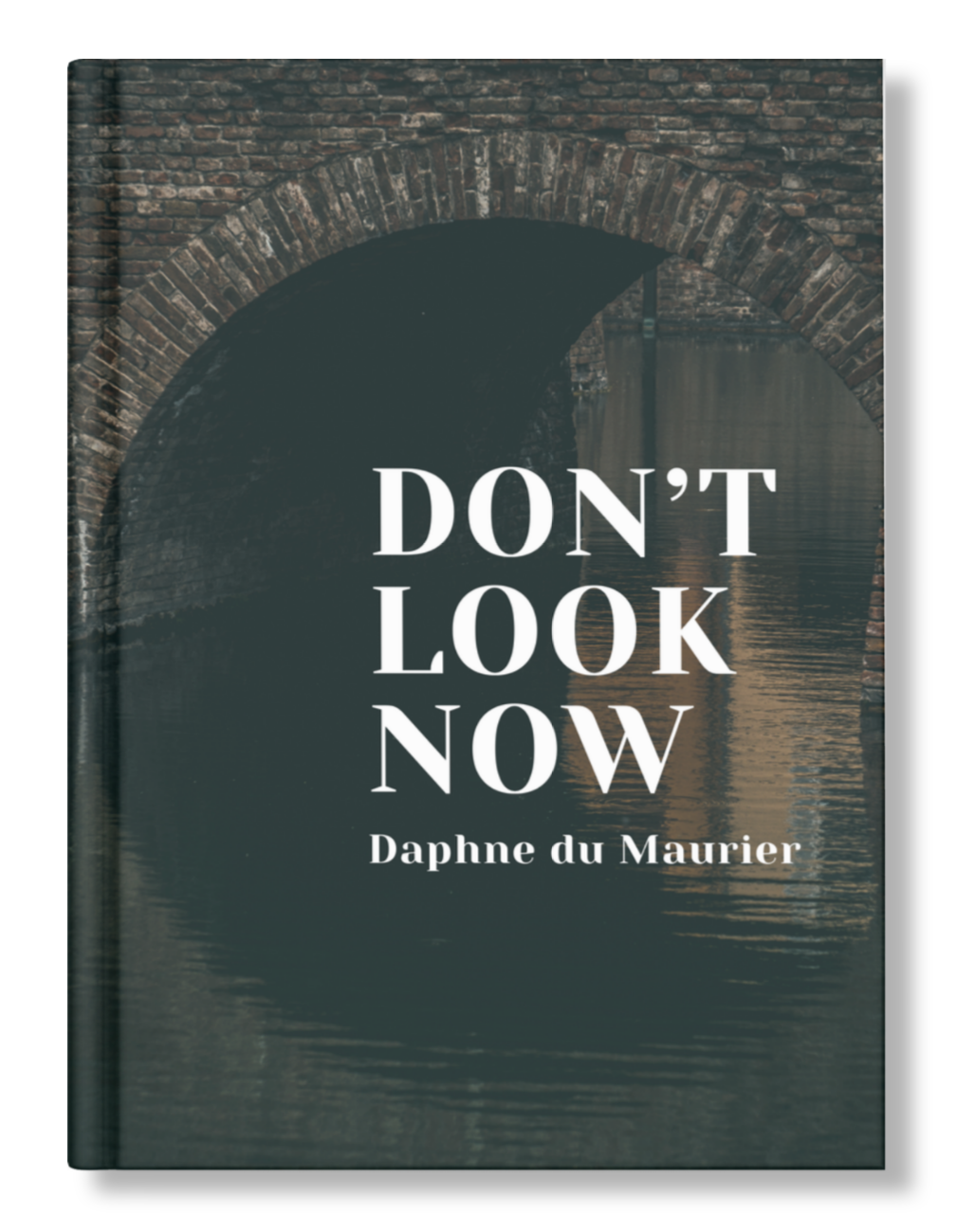
Objectives: To create modernized designs that capture each book’s themes and unique sense of unease through texture, color, and composition.
Process/Solution:
The Haunting of Hill House - I drew from the descriptions of the decor and the way the house alters itself. The sense of space bends and constrains as the characters explore their new surroundings and share their pasts. The arrangement of motifs and text is an organized unit, but evokes a sense of disorientation. I chose to use only one splash of color, blue, to represent the supernatural and psychological dread.
Frankenstein - Feelings of anxiety and tension were my main sources of inspiration for this design. Old paper peels just enough from the edges, while a contorted figure takes up space by pushing the text to wherever it will fit within the parameters of the composition.
Don’t Look Now - Using the defining feature of the book’s setting as my main asset, I choose a simple composition and a low saturation palette that sets a tone of the unfamiliar, grief, and isolation.
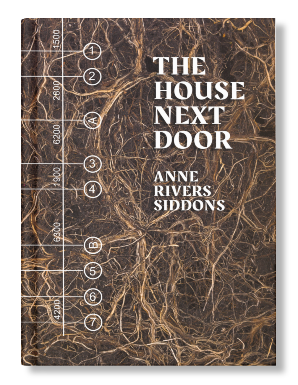
The House Next Door - The disruption and careless development of land is, personally speaking, the most vivid imagery in this book. The texture of roots in the soil beside a small fragment of architectural plans evokes the main character's visceral reaction to the new house and the disquiet throughout the neighborhood.
Tools: Photoshop, Illustrator, Lightroom, and public domain archives.
ALBUM COVERS
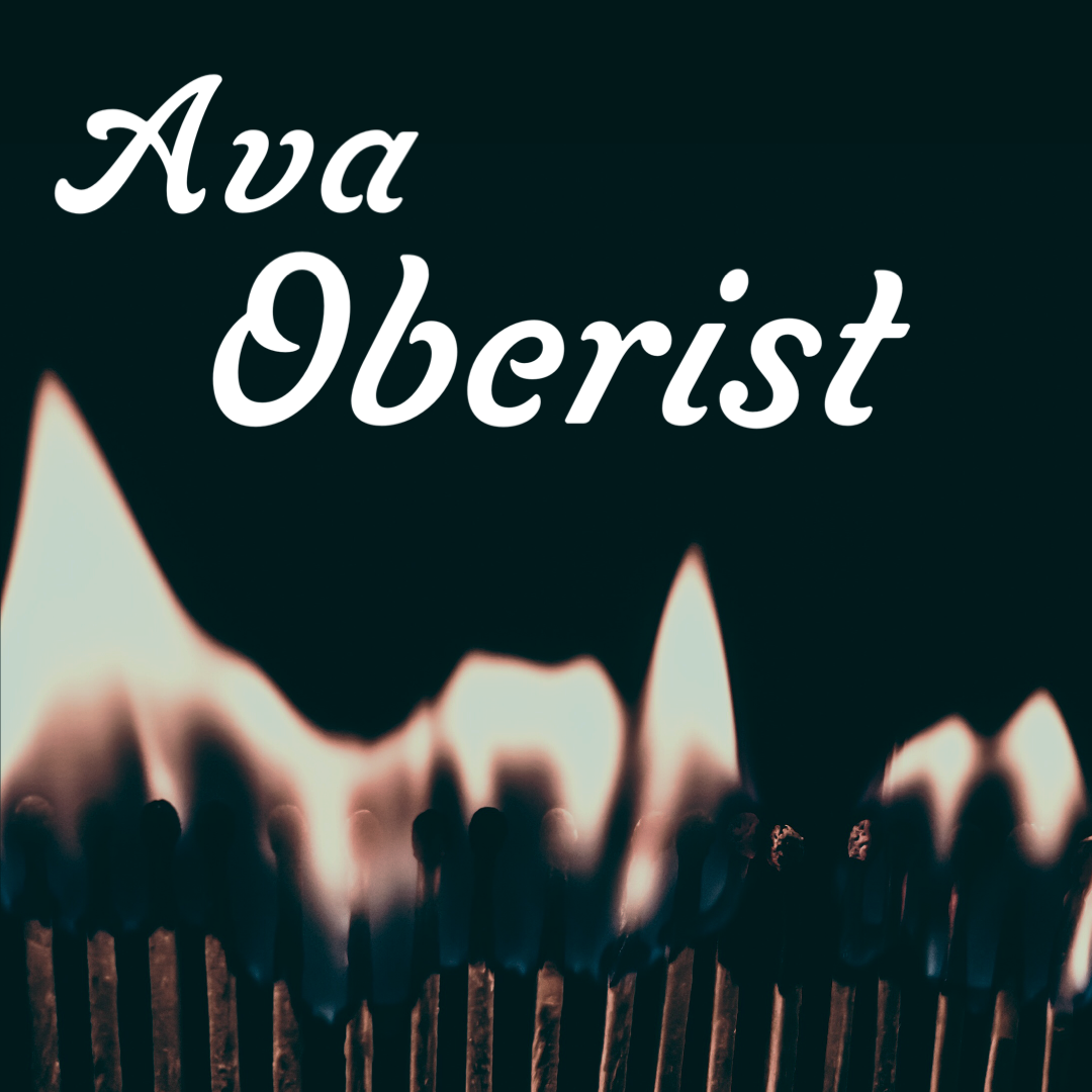
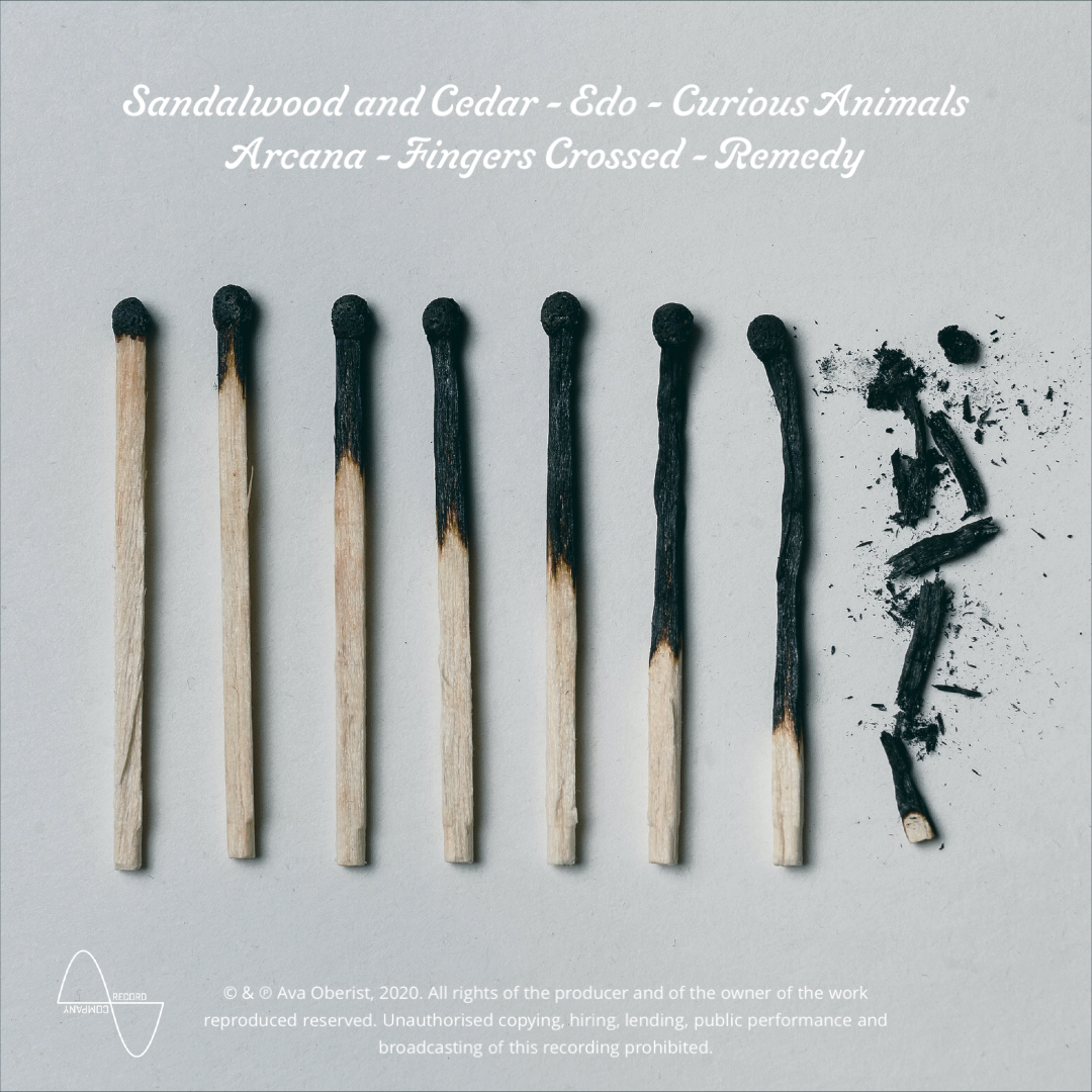

Ava Oberist, 2023
Objectives: Allude to cause and effect while creating more questions than answers.
Process/Solution: I used two separate photos of matches; one lit for the cover and the other a carefully lined-up row of used matches for the back cover. These images tell a story, but not a full one. The curious will have to listen to the album to learn the entire tale.
Tools: Photoshop, Lightroom, and Adobe Stock.


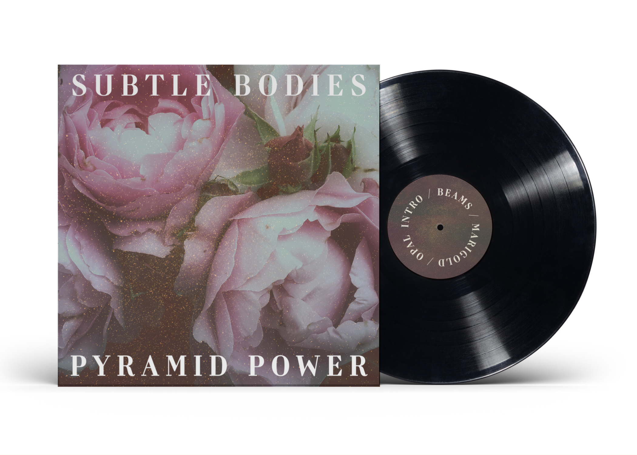
Subtle Bodies, 2023
Objectives: A sense of mysticism with a modern design.
Process/Solution: I used two separate photos of matches; one lit for the cover and the other a carefully lined-up row of used matches for the back cover. These images tell a story, but not a full one. The curious will have to listen to the album to learn the entire tale.
Tools: Photoshop, Lightroom, and Adobe Stock.
UX/UI DESIGN
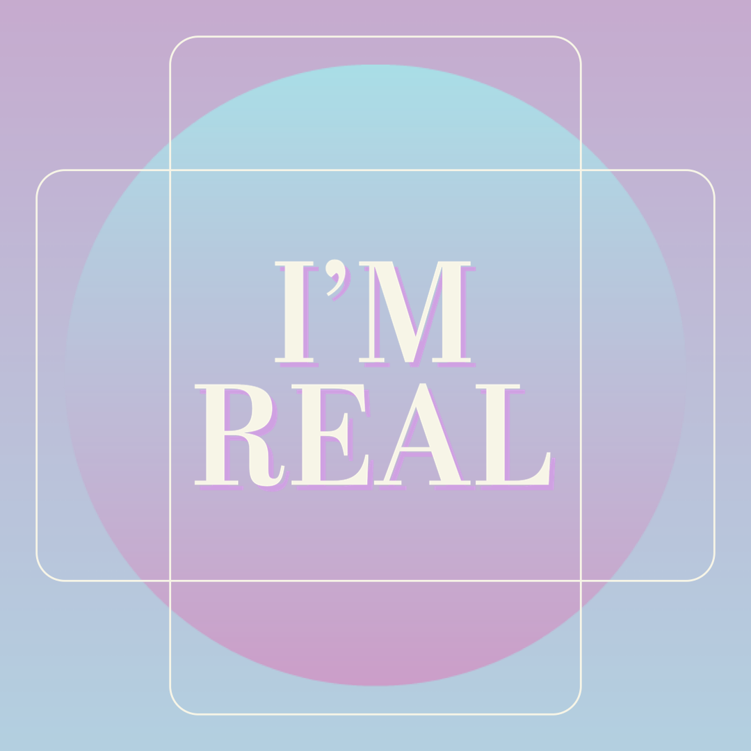
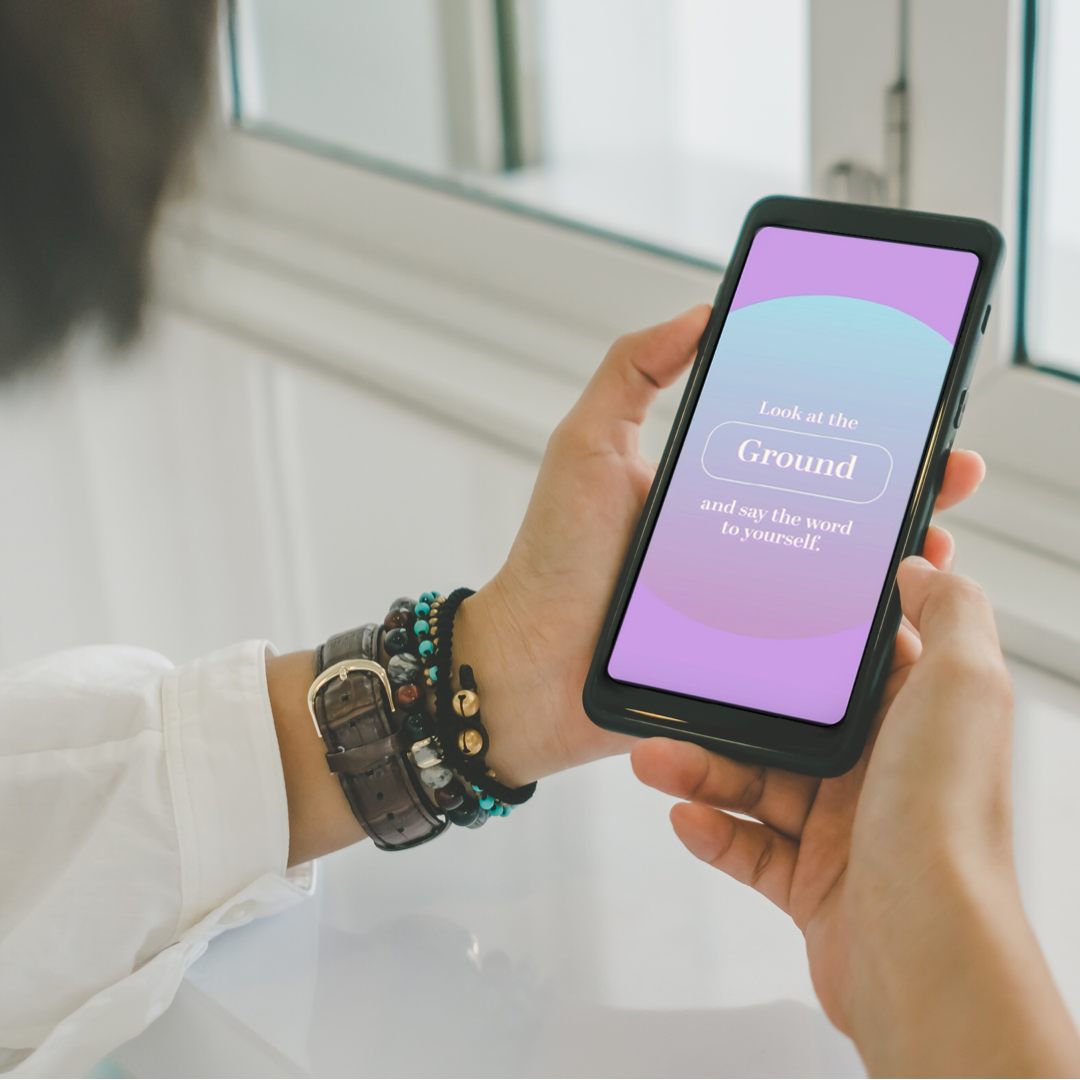
I’m Real is the prototype for an app that aids in coping with disassociation. It provides a common grounding technique in the form of a guided exercise, accompanied by soothing ambient music.
Tools: Adobe XD, Photoshop, and Premiere Pro
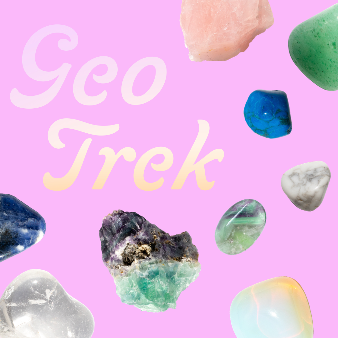
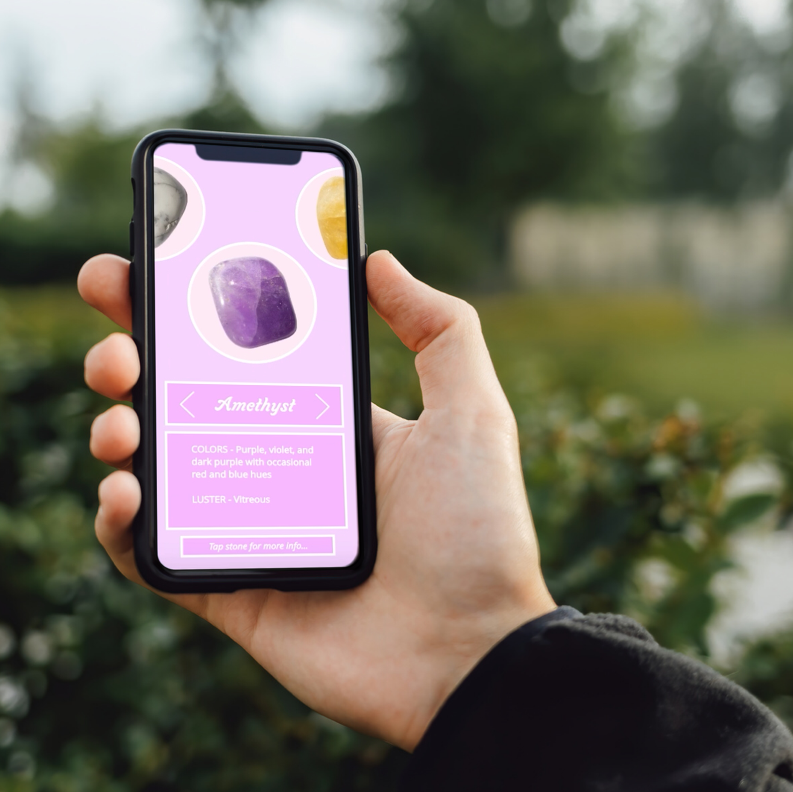
Geo Trek is a prototype for an educational app that breaks down information about stones, crystals, and other minerals in a way that makes identification and memorization easier for the kinesthetic learner.
Tools: Adobe XD, Photoshop, Adobe Stock, and Premiere Pro.